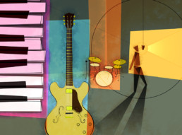
Garageband – Peachpit 2006
Producing the iLife and iWork covers, I worked to clearly define the “iApps” cover style to be different from Peachpit’s titles of books on Apple’s applications for professional video, music, and photography. We decided that a more textural approach would be a good direction to differentiate the two lines of books; clean precise graphics for the professional applications, and textural looser, more “down to earth” styling for the iApps.
When working on this cover, i wanted to explore a bit of history of recording and how the graphic style we’d agreed upon for iApps intersected with the history of music. There’s a good deal of jazz history and LP album artwork that fits in well with this style. I researched jazz covers from the 1940-1970 particularly in the blue-note catalog. The illustrations on the covers have a distinct character to them that is warm and inviting, and was fundamental in the pop-culture which helped set the tone for that era in music.
In the development of the composition for the illustration, i was making simple vertical bars of color that had a rhythm across the page. I chose to juxtapose iconic representations of instruments and then progress from a diagrammatic representation on the left to more traditional dimensional projection on the right. Covering the basic instruments of the band, i realized i could place the voice on the right and use radiating lines to imply the projection of the voice. (Coincidently, the disc also happens to look somewhat like the reel of a reel-to-reel recording deck, which was the standard in the recording industry for a half-century.)
After working over the composition and getting the elements in place, i began to realize that the color chip on the right looked somewhat like a garage door so I proceeded to add the shadows from the figure standing at the microphone, and continued the hints at the metaphor by including the boundaries of the garage interior behind the drums and guitar.
Completed spring 2006.


