helloMATA Gallery 2.0
semafore
UX + UI + IA + Choreography .:. 2015
Background
I’ve been interested in long-form animation as a format for composition since childhood. In 1992 I started working in animation. After learning basic tools, I began exploring procedural methods to experiment with ways to create abstract compositions which evolved over time. Exploring both 2D and 3D methods, in both analog and digital forms, I continued to find new expressions many of which resulted in static compositions “frozen” in time, and produced them as singular images.
In September of 2015 Apple announced the 4th-generation Apple TV and tvOS for 3rd party developers. I met with my colleague David Farmer and discussed an opportunity to leverage the new platform as a real-time renderer for evolving compositions as a form of art. I proposed we call the animated compositions “animata” after the Italian word for “animated”. David worked on the initial renderer for the platform based on a procedural animation I had created using a a particle system and lighting technique which David had also developed. The initial version was released in early November of 2015.
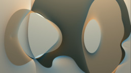
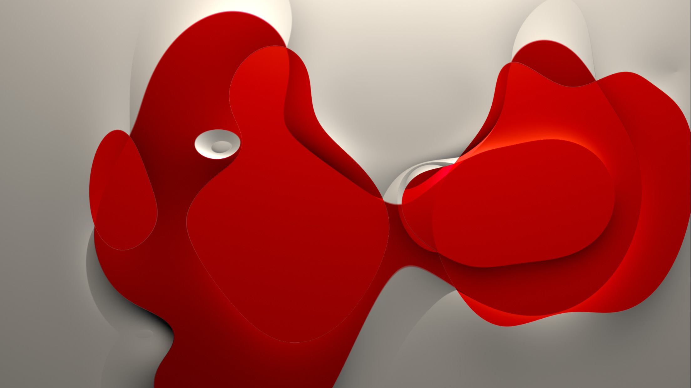
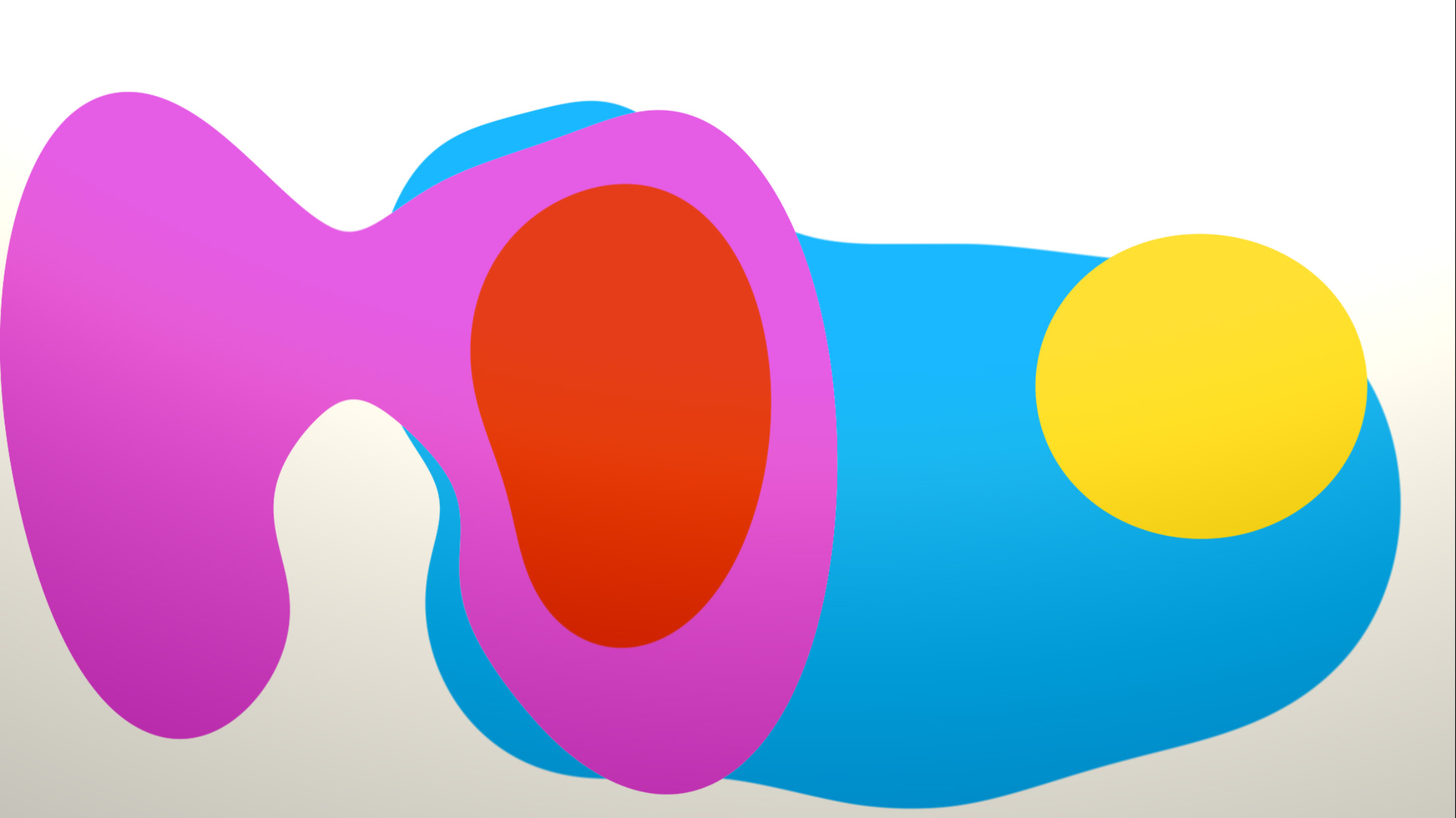
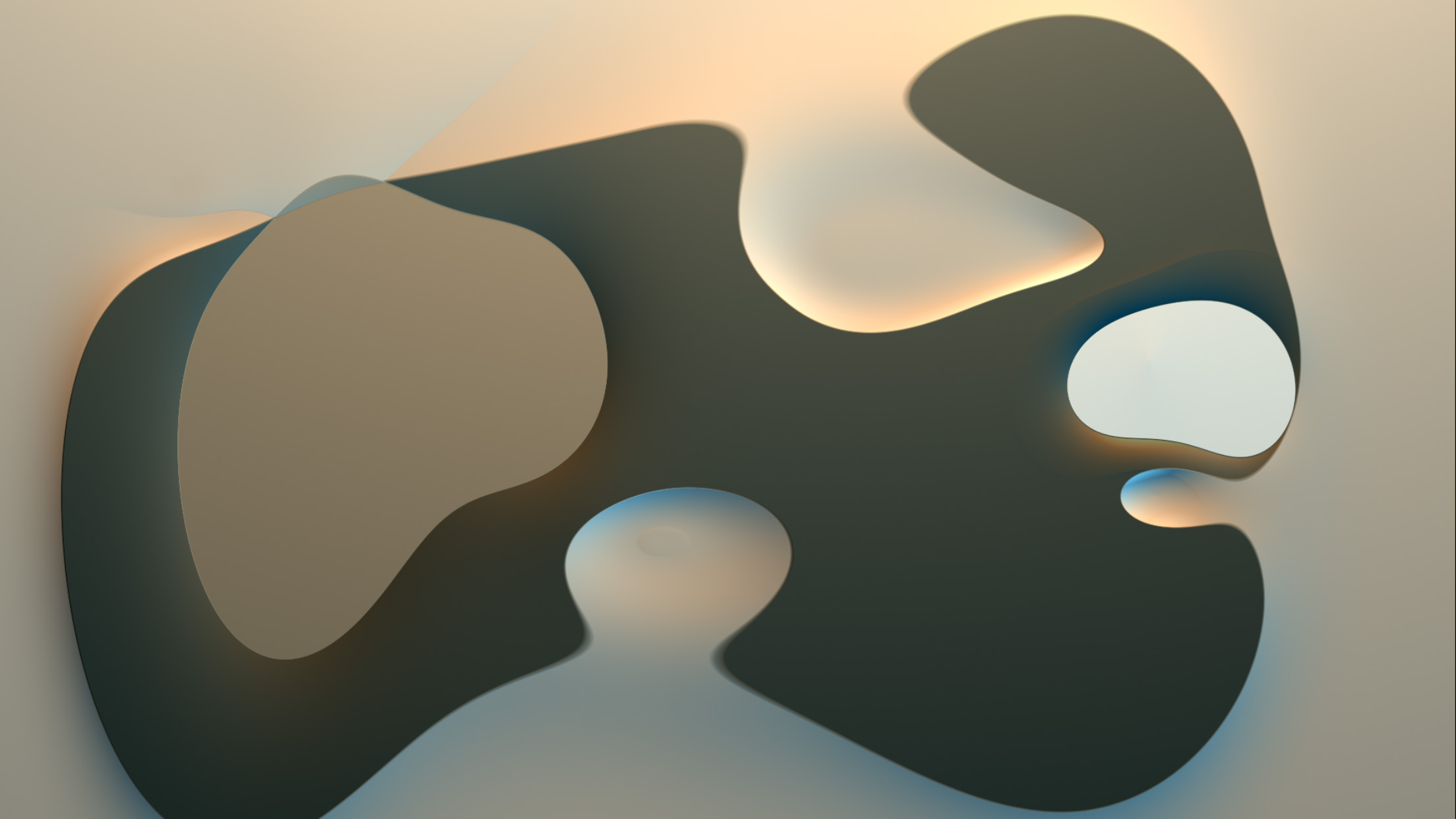
One of the shipping variations of “Musica Universalis” in the initial collection with helloMATA 1.0
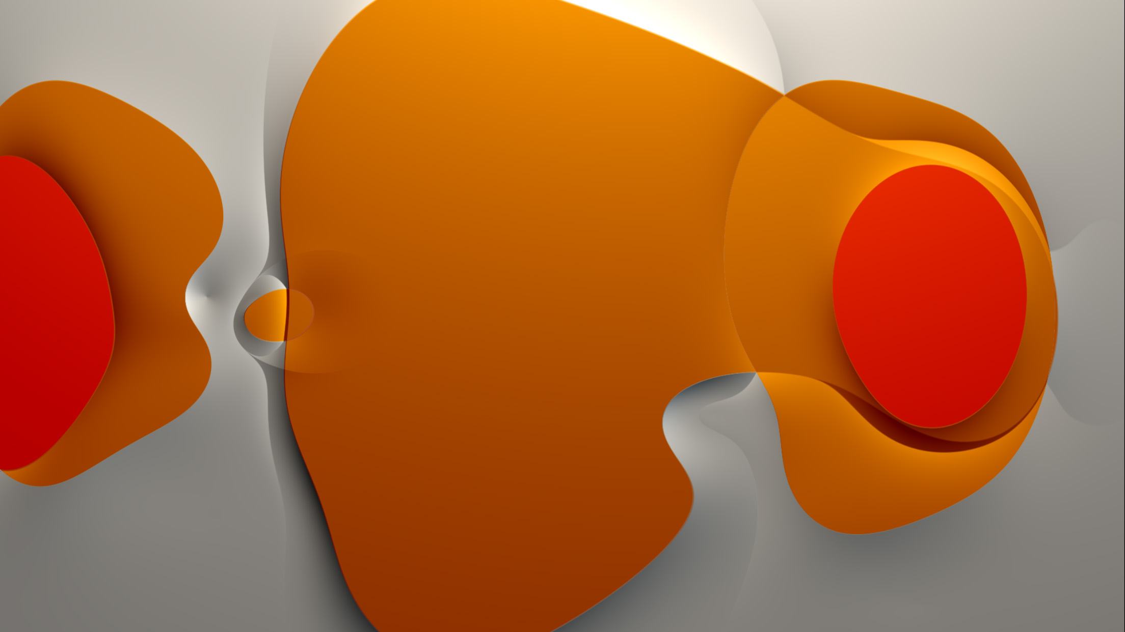
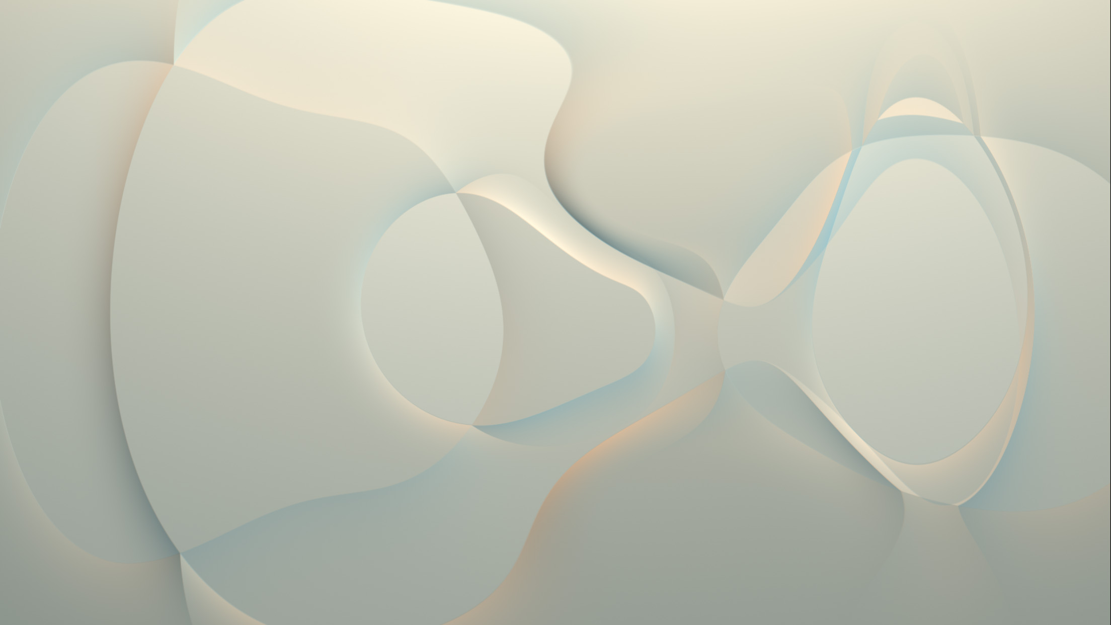
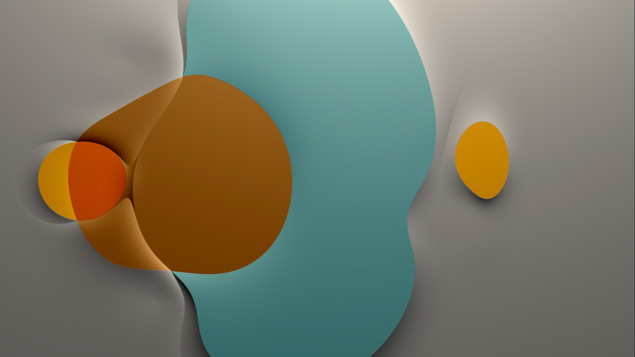
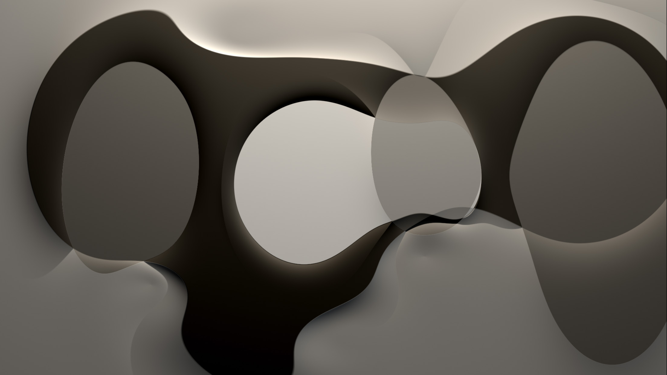
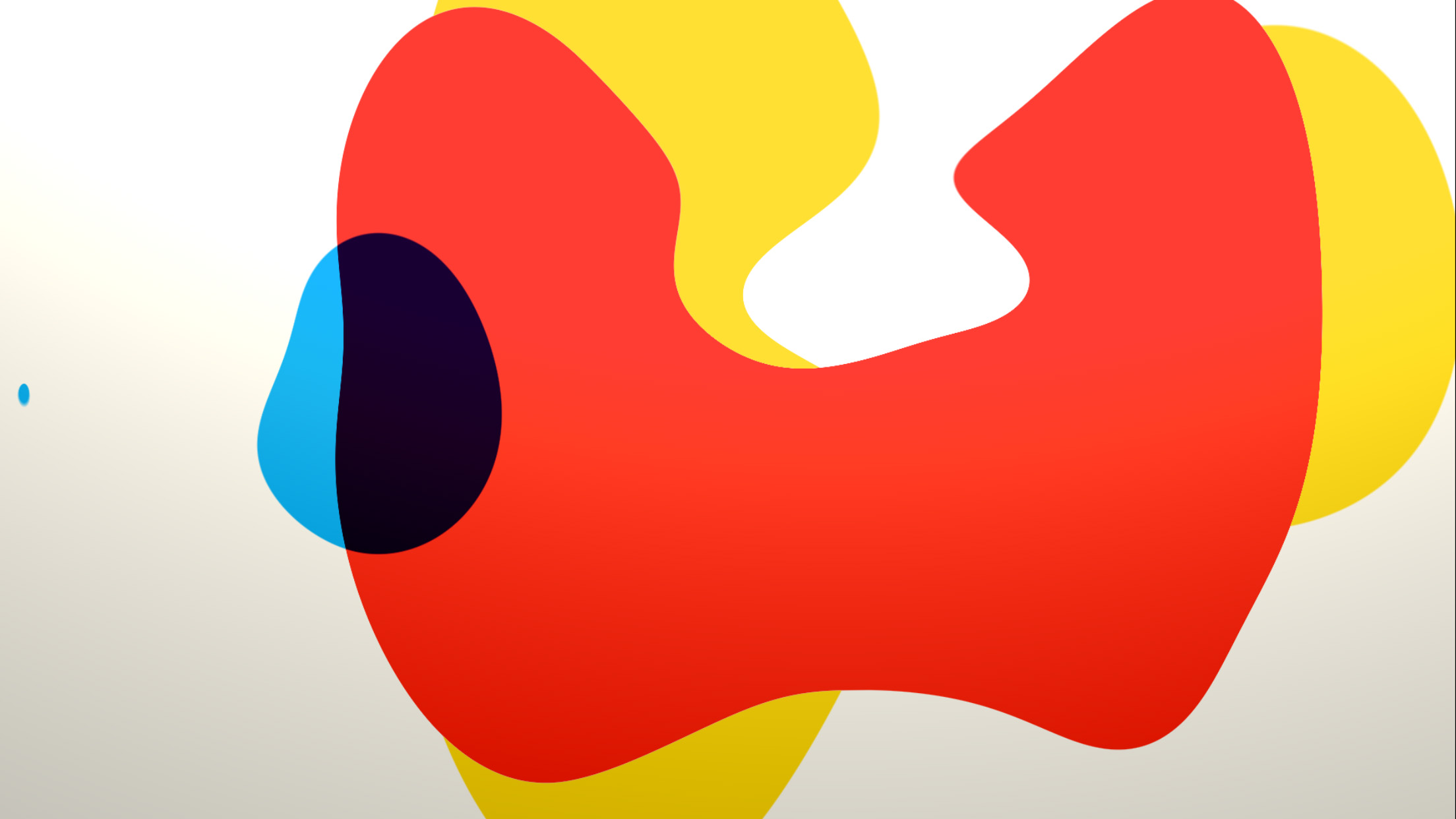
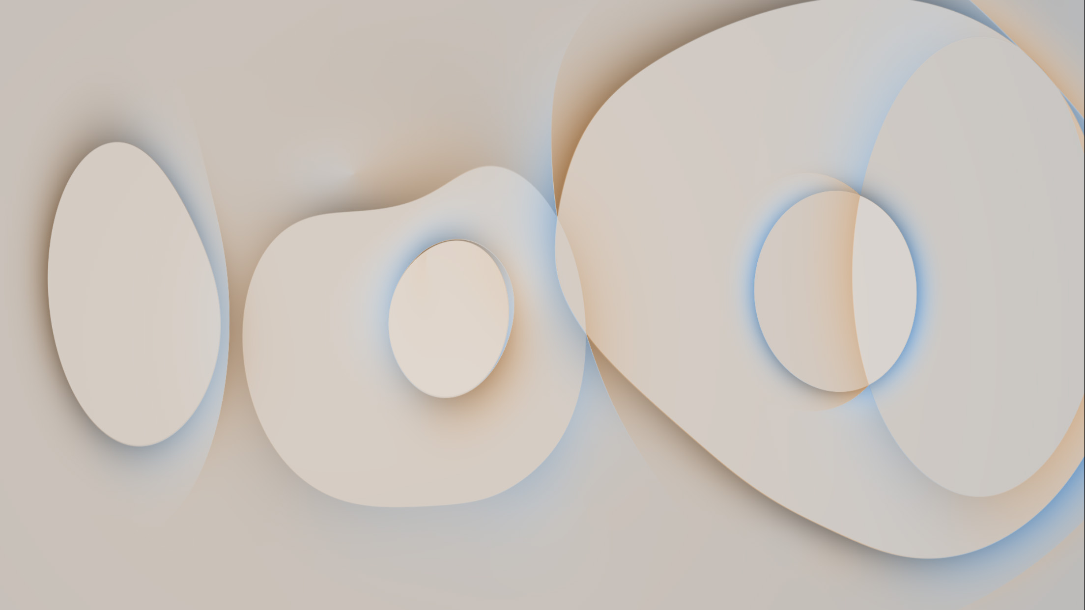
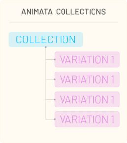
Variations of the composition under consideration for the collection.
Goals
helloMATA 1.0 interactions were intentionally simple, using only a click-through to navigate the 3 different variations delivered in the initial application. For the next version, we wanted to deliver an experience that provided a means to:
- select and play animata already in the user’s gallery.
- navigate to different animata,
- preview and purchase animata from the studio,
With this set of goals, I worked to establish an IA for the application, and a gallery to navigate the choices.
Information Architecture and Experience
In looking at how to establish the IA for the application and gallery, we considered what we intended to deliver as a collection of animata. When creating procedural compositions, there are typically a large number of variables and any number of viable outcomes that fit together as a set. As a result, we decided to package a set of variations of a procedural method into a collection. One variation would appear as the “cover” view for the collection. This provided a basis for organization of the animata.
I wanted to keep the intent of the product in mind as we chose paradigms for the application, staying true as a delivery medium for animated compositions. With that intent, I recognized there were 2 main tasks in which we wanted to highlight the compositions:
- For playback – review and select a previously purchased (or a default) animata;
- For purchase – review and select a collection for purchase from the store.
I decided the application could be divided into two main sections: the gallery, and the studio. The user’s Gallery was where purchased collections would reside. The Studio would then contain the published collections available for purchase. We also wanted to accommodate additional information about the format for reference as well as publishing announcements and news. The resulting IA map shows the top-level menu with these affordances in place.

Using this approach, we could develop and package animata and variations as collections and update the online store with new work over time.
For navigating the collections, I wanted to display the content in a contemplative manner, allowing the user to review each collection before purchase or viewing.
The rationale was that the traditional grid-based approach, leveraged by many TV and streaming services, is focused on displaying many choices to their audience simultaneously. I wanted to provide a less frenetic experience, allowing the customer to discover the work in more leisurely fashion. To explore options to achieve this, I considered interactions on tasks such as searching for an image through a catalog, playing cards, gallery walk-through experience, and reviewing prints in a stack. The print/stack approach seemed a good fit, and there were advantages from an interaction perspective:
- The compositions were uniform sizes so presentation could be cleanly aligned
- Interactions on inputs such as a track pad or touch screen could match the motion of movement in the UI
- Swipe gestures are generally more soothing interactions than a stab/poke/tap approach
- Isolation of a composition for consideration is part of the stack interaction by highlighting one image at a time.
To achieve this type of interaction, I proposed we leverage a carousel method for navigating the works available in the gallery and the studio.
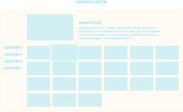
Grid based navigation.
The user moves the selection around the grid.
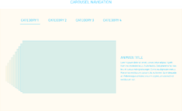
Carousel based navigation.
The user gestures left or right to navigate the images.
Diving and Surfacing
Another consideration for the experience was how the user should navigate between stacks of images. Since we had decided the carousel approach seemed like a fit, I looked at ways in which we could navigate between the carousels, and how that interaction should occur. Diving and surfacing provides a convenient metaphor to help a user understand the depth at which they are in an application or set of information.
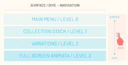
Each “band” of the interface provides a new level for interaction and information to the viewer. Using the diving approach as a vertical gesture, I the could use horizontal gesture to move through information at that level, preserving the interactions learned at the previous level, and simplifying the model.
To see how this felt in practice, I created the following motion study to test how this might feel as an interaction. I was concurrently developing UI approaches so applied the current state of the design to the study for a better understanding of how the product would be perceived.
As a handheld experience, this interaction seemed a fit. However, since the initial target deliverable was to be the AppleTV, and the viewing experience would be on a television of variable dimensions based on the user’s equipment, I realized the large scale motion could be jarring and potentially vertigo inducing. In subtle amounts, the interaction would still provide a useful method to convey depth of navigation.
To resolve the issue, and still employ the same mechanism, I chose to decrease the amount of vertical camera move when navigating while relying on near-field elements of text and line to convey the diving aspect of movement through the IA. The final interaction model illustrates this more limited range motion in the interface.