OurGov
See/Change, LLC
UX + UI + IA + Identity .:. 2013
OurGov Site ➔ .:. Download on the App Store ➔
Goals
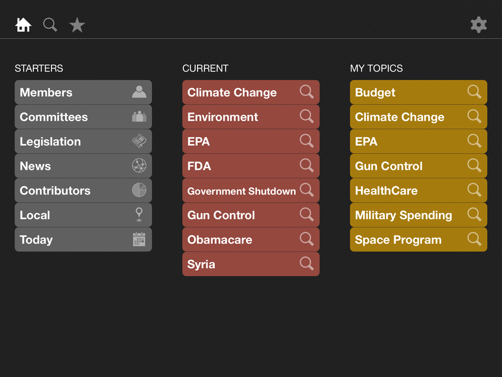
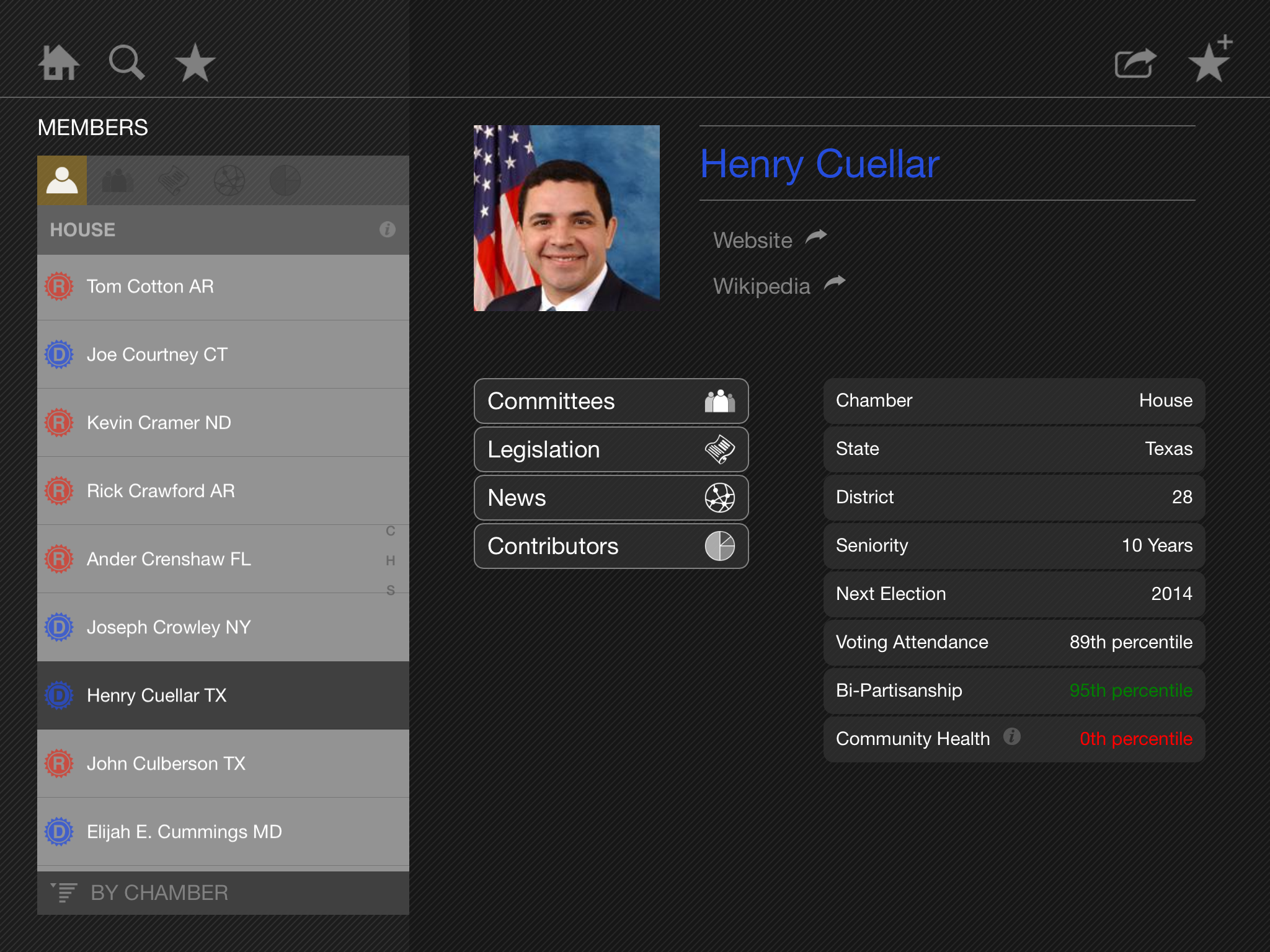
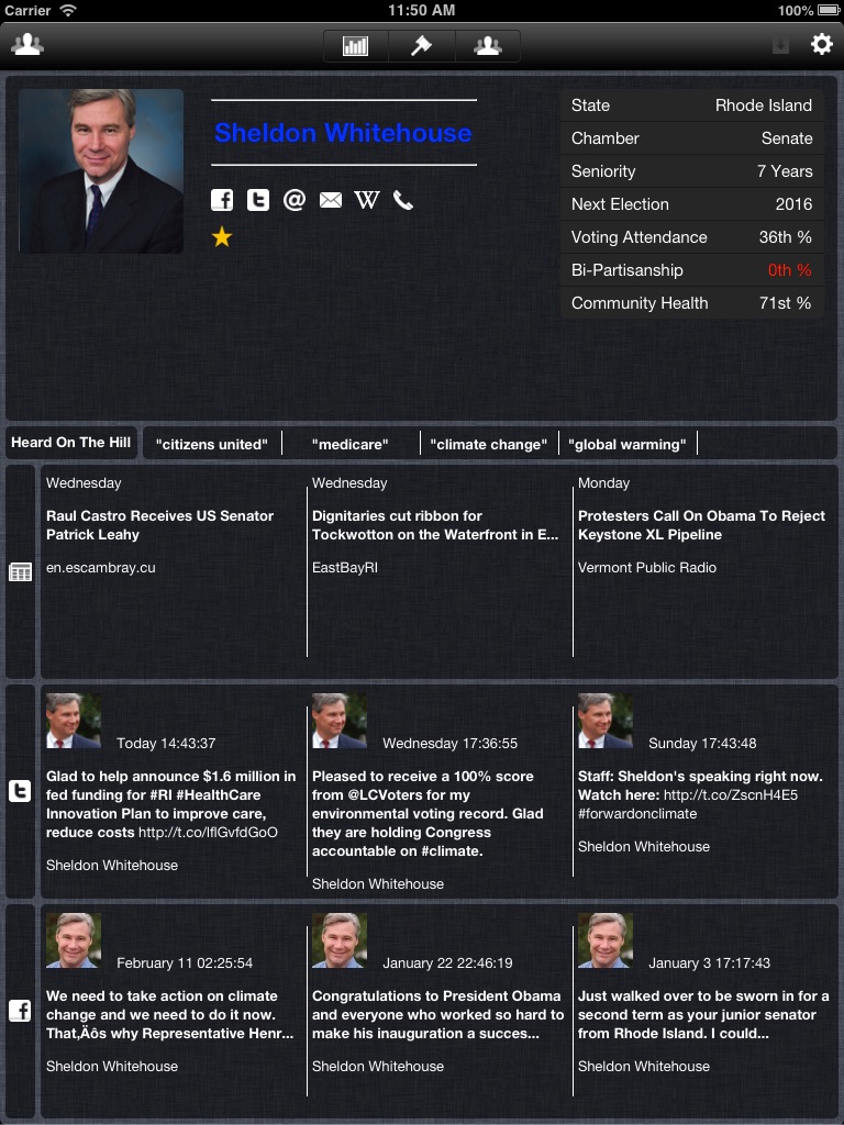
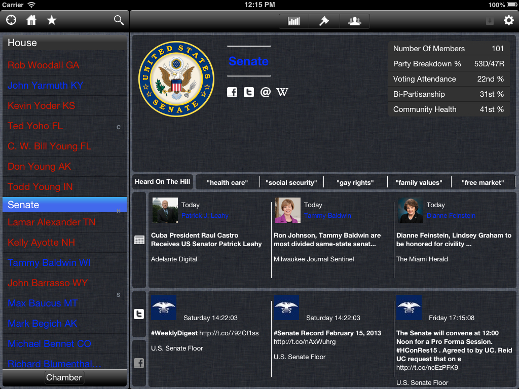
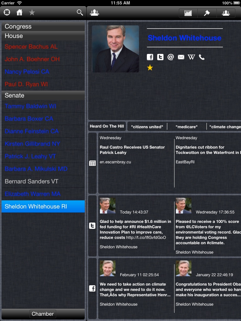
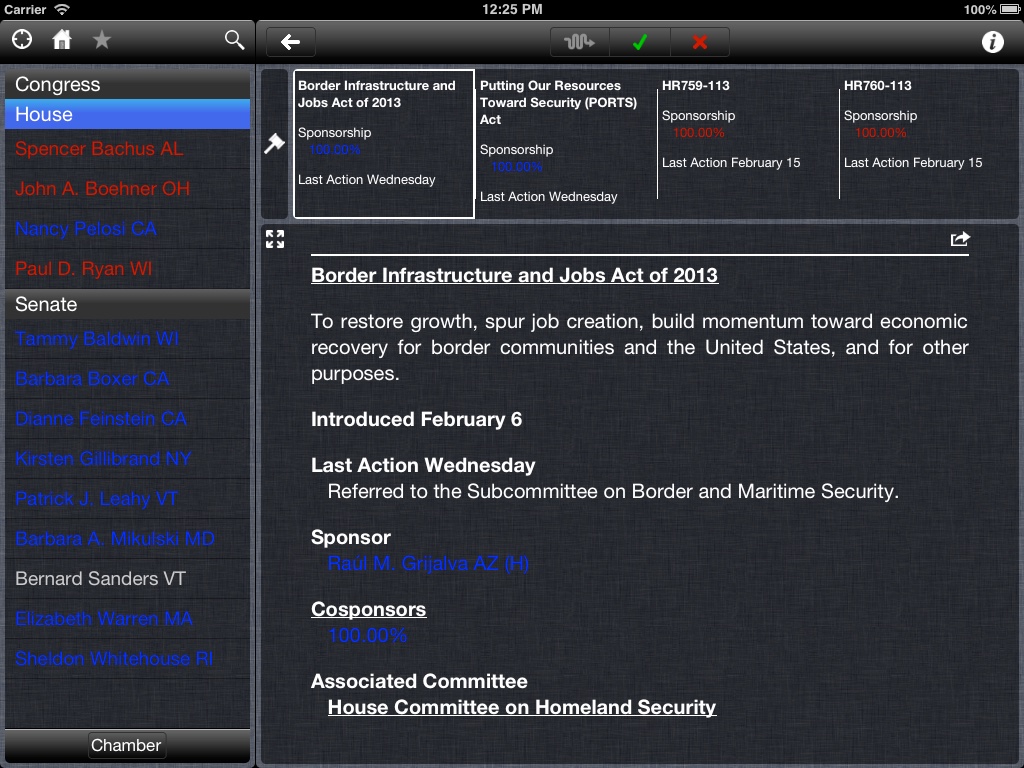
Working with my former colleague Charles Best, we redesigned the workflow and GUI for his iOS app “OurGov”. The back end of OurGov aggregates and indexes open government transparency data on congressional records. The data also includes social network feeds and news articles about Bills, Congressional Committees, and Members of Congress.
Origins
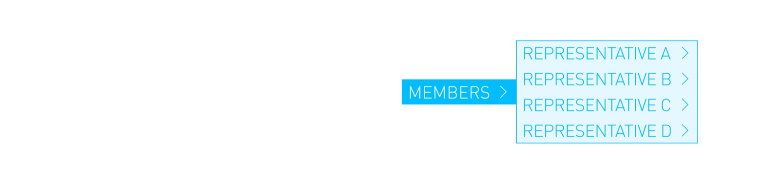
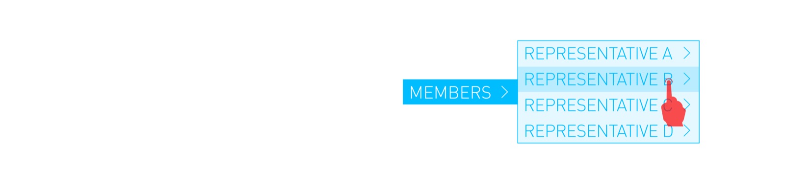
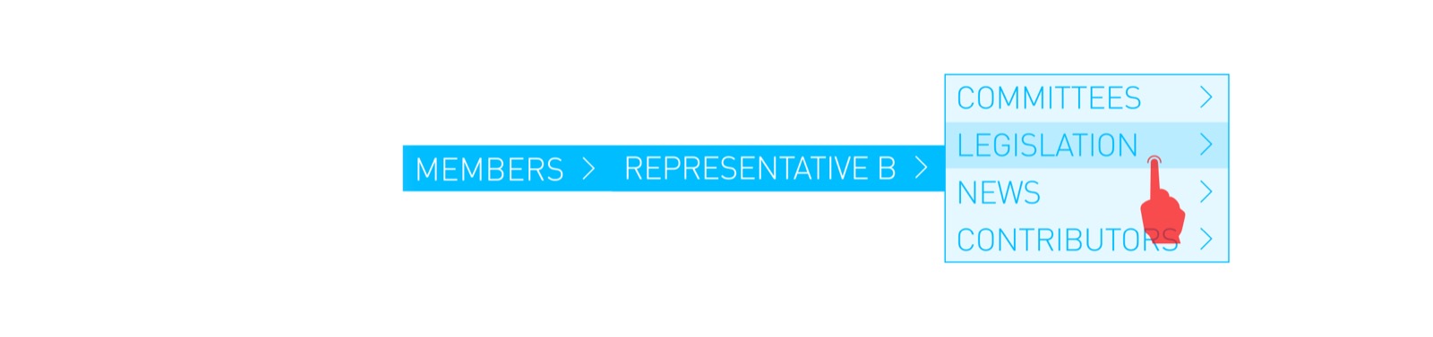
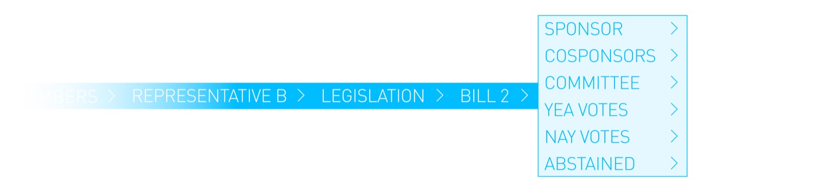
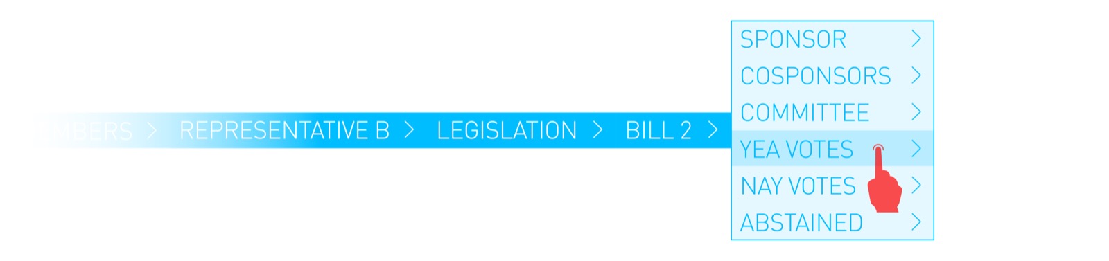
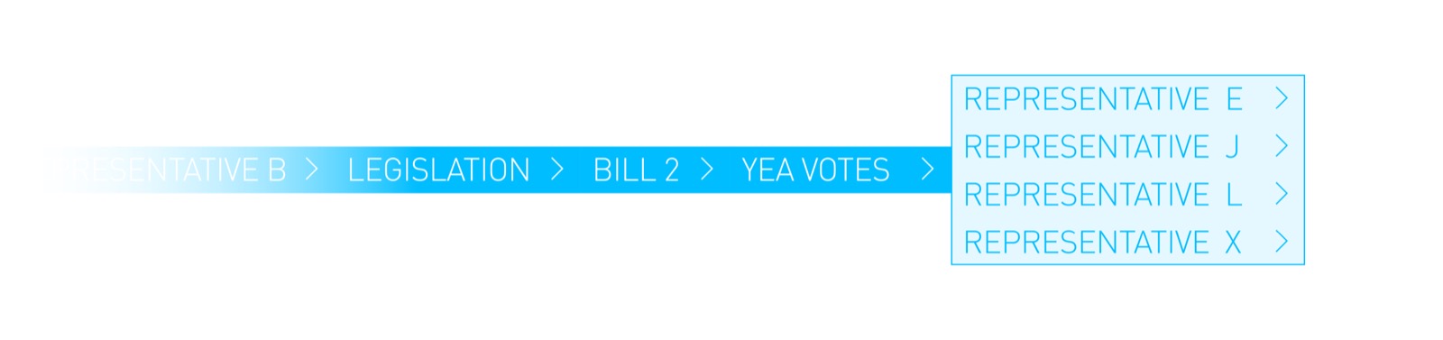
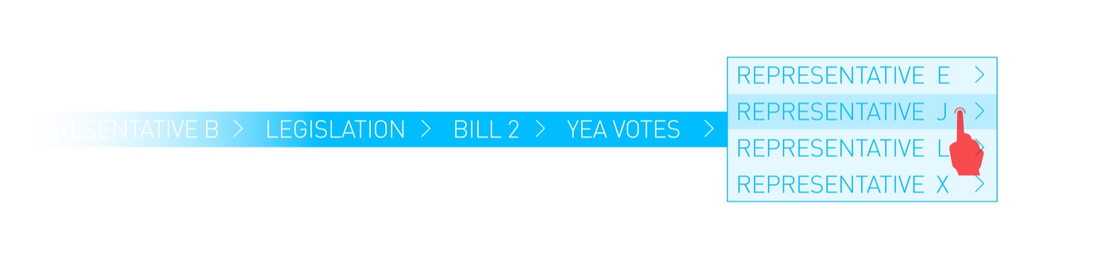
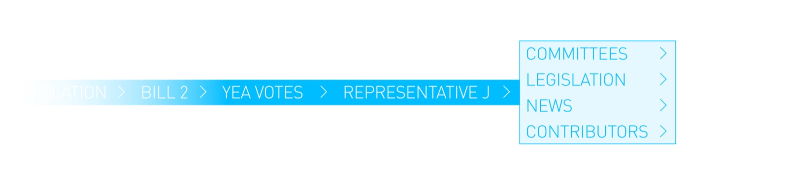
The original version of OurGov focused on specific data, and user flows. The user had to understand a very narrow intent of application logic to effectively interact with the application and data. This narrow set of interaction principles made the application less approachable and the relationship of data less obvious. Additionally, navigation of the data was very specific. In many cases, selection lists and their relation to data views would change position as a result of a categorization of data in the list; a structure and condition which was equally difficult to ascertain. The images below illustrate some of these issues.
Redesign
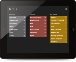
In the redesign we decided to redirect the app flow towards the concept of topics and searching. This meant the user could start with a preset collection of topics delivered on a semi-regular basis. From that point onward, the user could make their own flow, ad hoc, by simply tapping to discover details as they saw fit in their research.
It was decided that the user should be able to easily discover their own path of connections between constituents, committees, legislation, news feeds and political contributors. This freely extensible research pattern would be stored in a history allowing the user to go back to a previous article and explore a different relationship in the data.


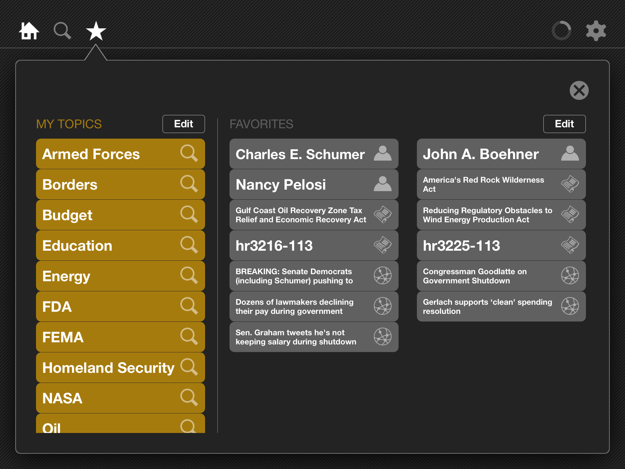
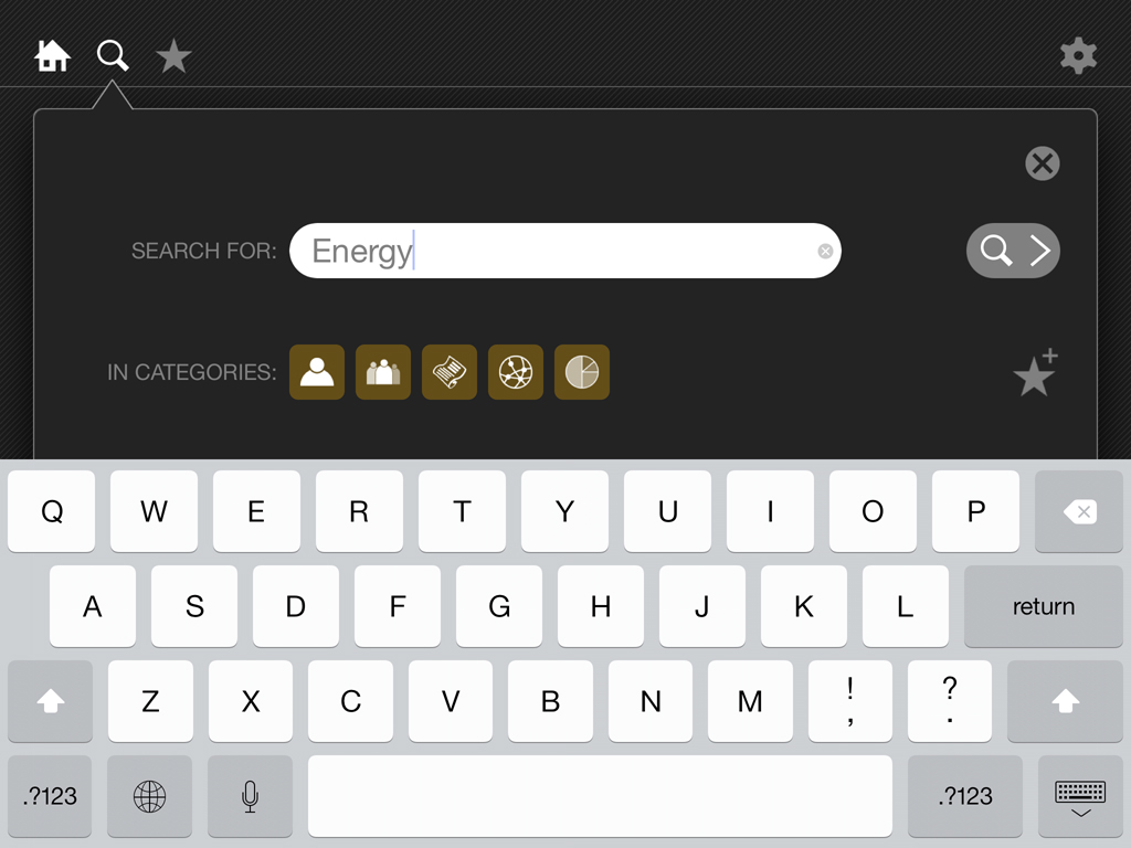
Search is a fundamentally useful function for research. A method to integrate Search with a first class UI flow was created so the user could find specific topics and associated data, and save their query for continued research as new data became available.
The decision was made to design and build a new “surf-able” front end for the data for iOS, specifically iPad. In order to achieve this we designed and implemented the following changes to the architecture and UX:
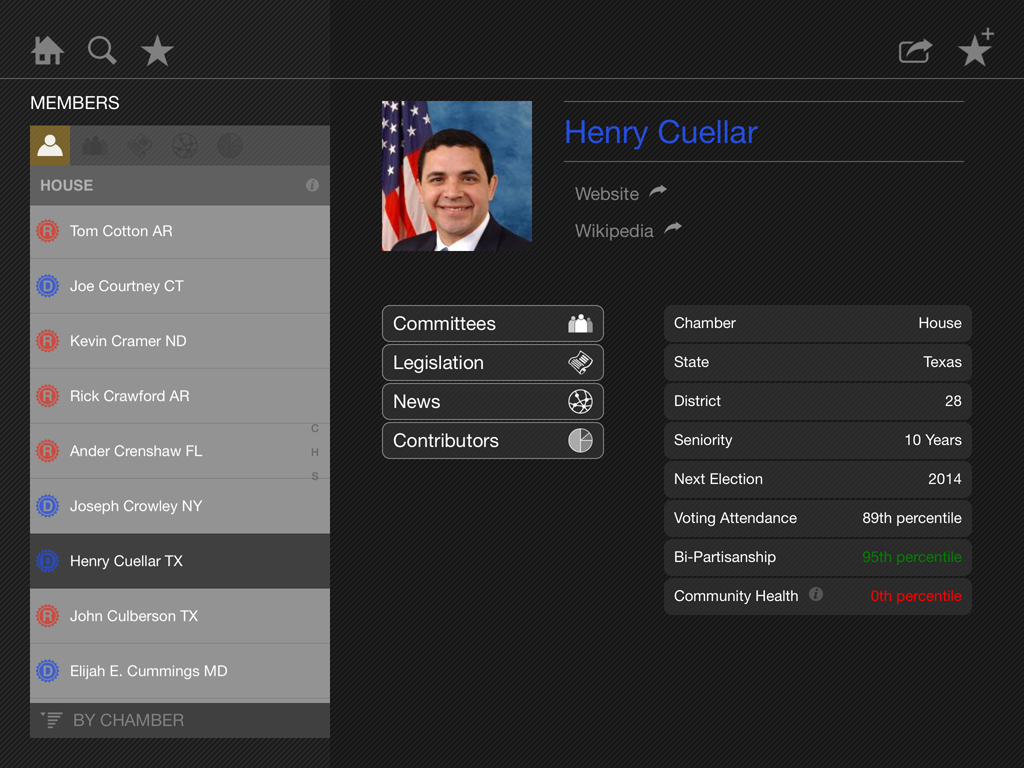
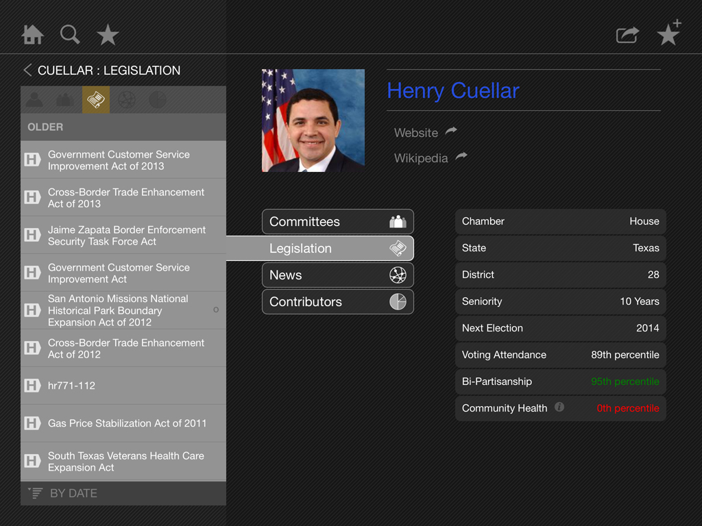
- Navigation was made uniform
- Lists were centralized and re-structured
- Selection of an item was made to consistently indicate the data set which was revealed and the relationship more obvious
- Filters and toggles were consistently displayed above lists
- IA was reconfigured to provide a simple unified method of data set recall via a bookmark “favorite”
- A method was implemented to store searches via a user created bookmark as method for the user to recall them quickly

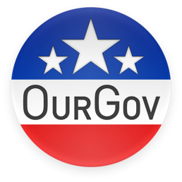
Brand
The brand of OurGov also was due for an update. The iconic badge design pays homage to campaign pins of congressional races, with stars and set in patriotic colors.
The App icon was created as a square variant of the OurGov button badge. Additionally, the logotype and iconic stars are used in one color applications such as the application splash screen which is seen on launch.