Image Browser
EndeavorDev
UX + UI + IA .:. 2014
Background
The Image Browser project was developed as a testbed for validating a UX/UI rendering engine which I had proposed to the graphics engineering group. Over the previous 6 months prior to starting on Image Browser, I developed the architecture and specification of the engine . Working with graphics engineering teams I investigated the existing technologies available at the time that would effectively render next-gen UI and interactions within Android. At that time, no solution was found which was capable of meeting the challenges of the UX we were attempting to achieve, while satisfying the business requirements. As a result, I worked to spec the design for an engine which would meet the needs of the visual and interaction teams.
At a high-level, the architecture I proposed for the engine would provide:
- a 2D layer based compositing approch to screen layout
- run-time rendering of file based vector assets
- procedurally created geometric primitives generated on demand
- a semantically consistent method of filtering, masking, and affecting objects for render and animation
- a consistent approach to animation and timing of element transitions.
- an integration of composite oriented blending of 2D and 3D scene components including, opacity, and composite modes
- 3D scene integration within a 2D compositing environment
- basic Lighting and camera methods in 3D layout
- consistent scene description nomenclatures for 2D and 3D
- example Parameter definitions for all 2D and 3D components
Goals
Image Browser was designed with a simple premise: exploring captured images should be delightful and engaging. When considering approaches for IA on which to build the product, we were struck by the following issue:
Users are comfortable with content existing in several contexts; a single piece of content should be available in as many contexts as desired.
I sought to come up with a solution that would allow this notion of an arbitrary contextual grouping while leaving the core data set of images unaltered. The research resulted in a set of basic assumptions which would allow for immediate implementation in the product, while providing a path for future growth:
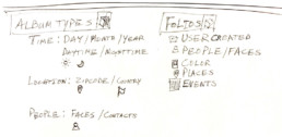
- Images should be considered as a persistent data set which could be arbitrarily aggregated into folios
- A single image can exist within many folios simultaneously
- Folios can be created and destroyed without deleting the images within them
- User agency or automated methods can be used to create folios
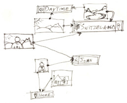
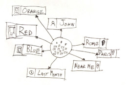
- Algorithms could be developed and extended to automatically create folios based on a user’s preferred criteria. For example:
Location | People | Time of Day | Color | Event | Search term
Auto-generated folios would be populated by an algorithm allowing the user to examine their content in new and meaningful ways.
Image First
After much discussion as to how to build an MVP from this concept, we decided that the application should have an “image-first” philosophy for the design, making the content the focus.
After exploring different options for the representation of the images, we decided the less interface the better to keep the images the heros. We minimized any elements which would distract from the imagery in favor of using text labels overlaid over imagery.
IA and Rationale
The IA decided upon in order to achieve this approach provided a two level hierarchy where appropriate:
- A category type would contain albums created by that category;
- An album contains an array of images in a single level arranged in potentially different methods.
Employing that directive, we chose 4 categories which drove the visual representation of this concept on the main page of the application:
ALL
A Quick access point to all images within the user’s image library
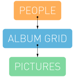
PEOPLE
Auto-generated albums based around unique facial identity discovered in the user’s image library
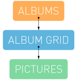
ALBUMS
User created and curated folios within their image library
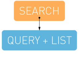
SEARCH
A method to search through the images using name or other metadata associated with the images
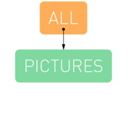
ALL
A Quick access point to all images within the user’s image library
PEOPLE
Auto-generated albums based around unique facial identity discovered in the user’s image library
ALBUMS
User created and curated folios within their image library
SEARCH
A method to search through the images using name or other metadata associated with the images
To keep the content fresh on the main page, images from each of the first three categories would transition gently, within their respective sections in a simple and elegant manner as the application remained on the home screen.
Wires and UX
After basic flow was decided upon, I generated wires for all main views, mapped interactions, and proceeded onto the visual design of the app.
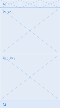
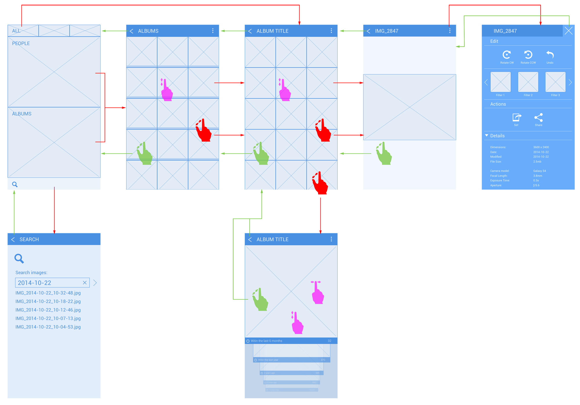
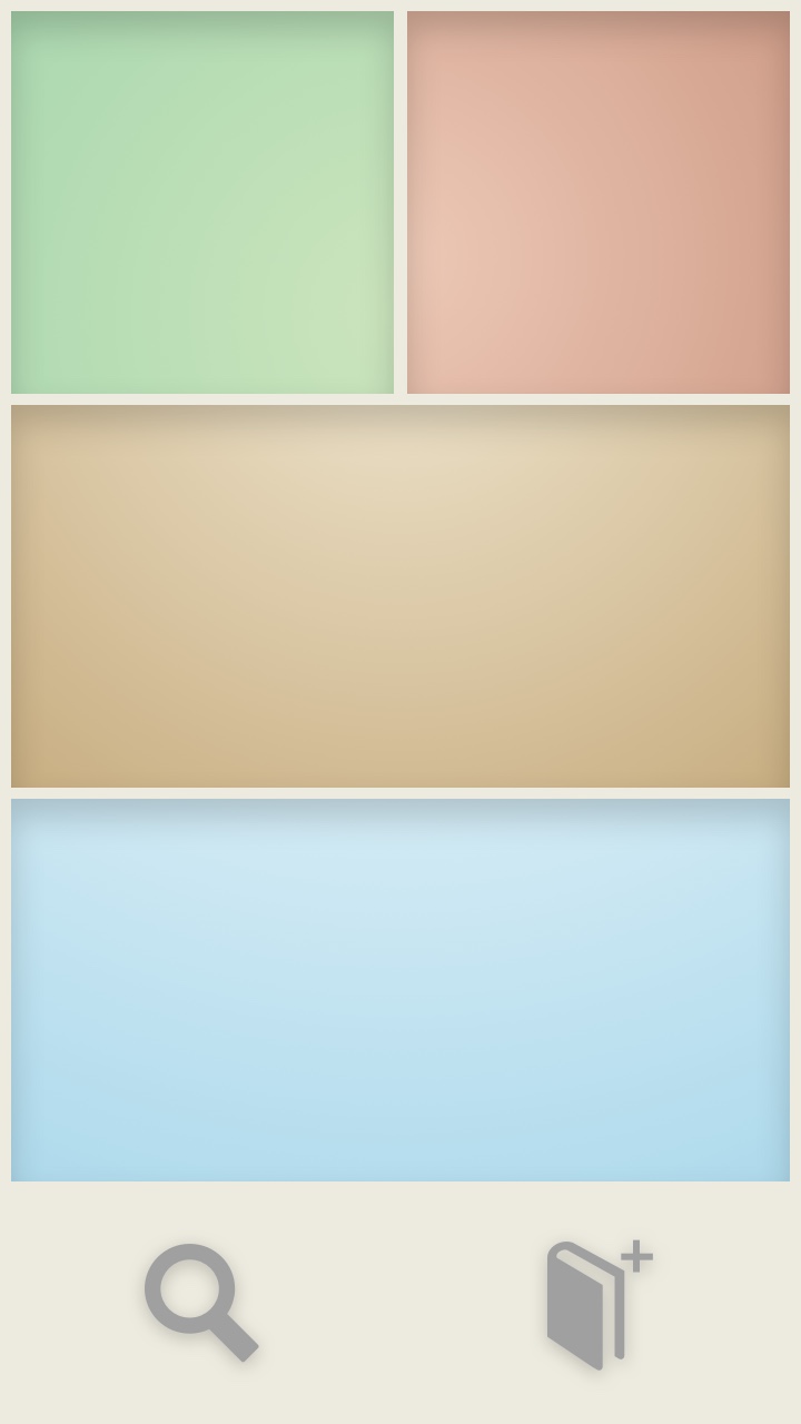
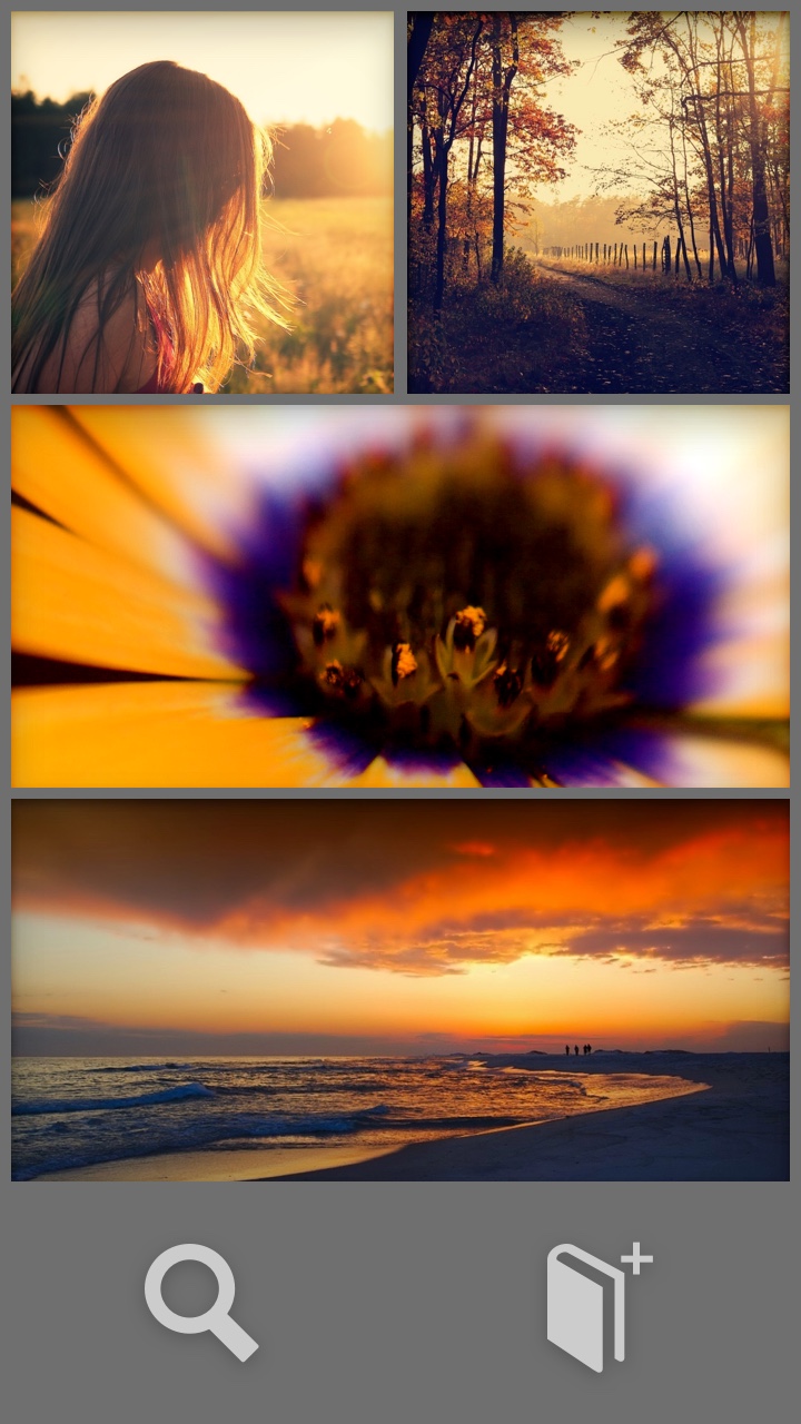
MAIN SCREEN
The Main Screen holds the access points for the primary categories displayed as subdivided horizontal bands: ALL; PEOPLE; ALBUMS; SEARCH.
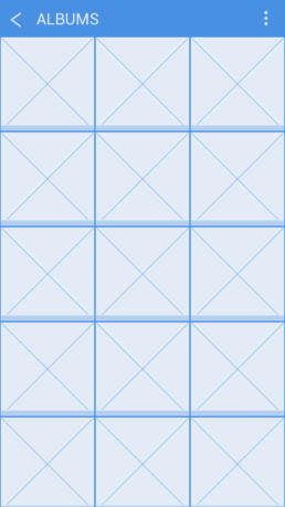
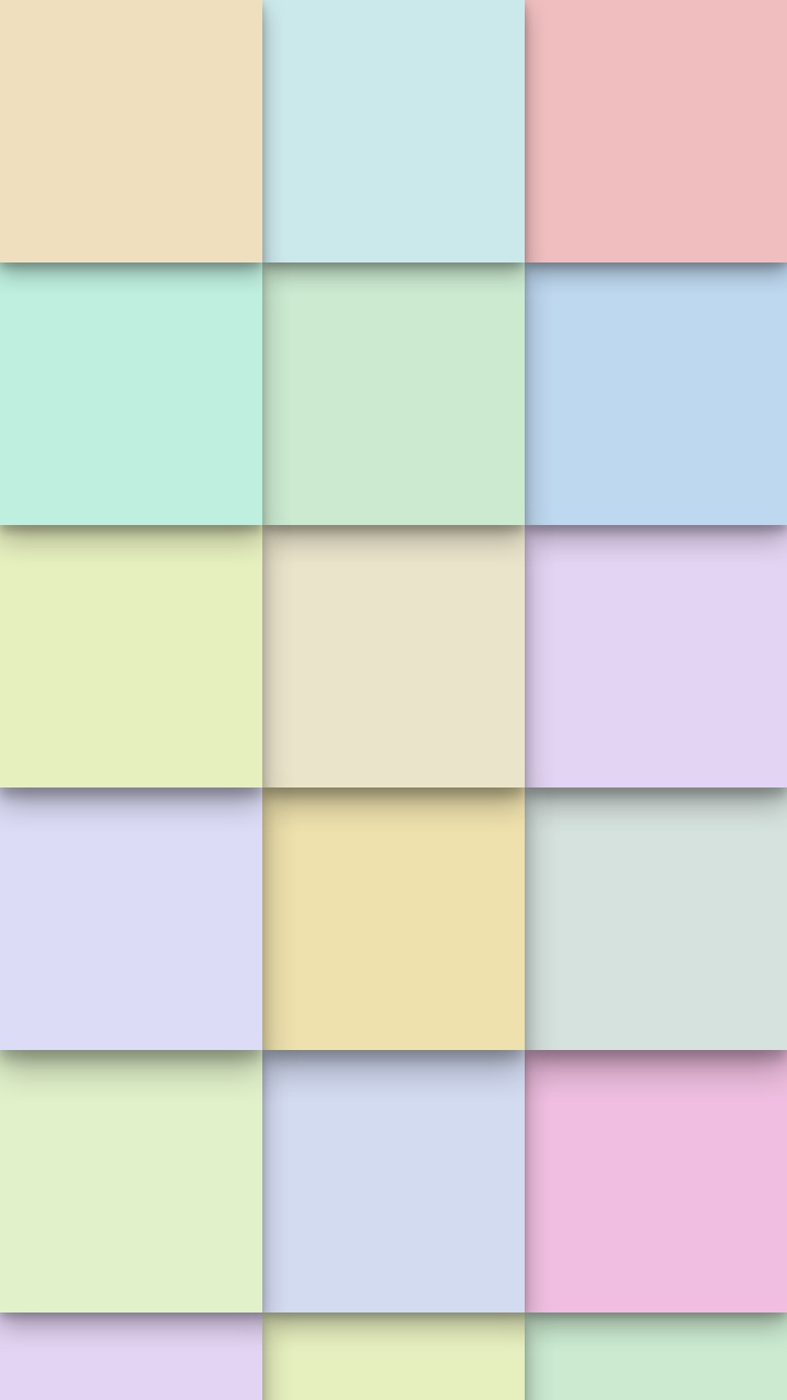
ALBUM GRID
In this layout, the albums are presented in square tiles with a slightly raised look to indicate that “more” lies behind each tile. This view is accessed when there are multiple albums for a single category.
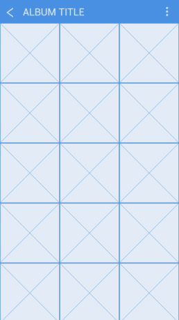
IMAGE GRID
The images within an album are laid out in square, flat tiles. The images are arranged by time with the upper-left image being the most recent.
INTERACTIONS
Tapping any of the sections transitions the screen to the next level of the hierarchy for that section.
INTERACTIONS
Tapping an album tile selects that album, hiding the unselected albums, while transitioning the images from the album into view.
INTERACTIONS
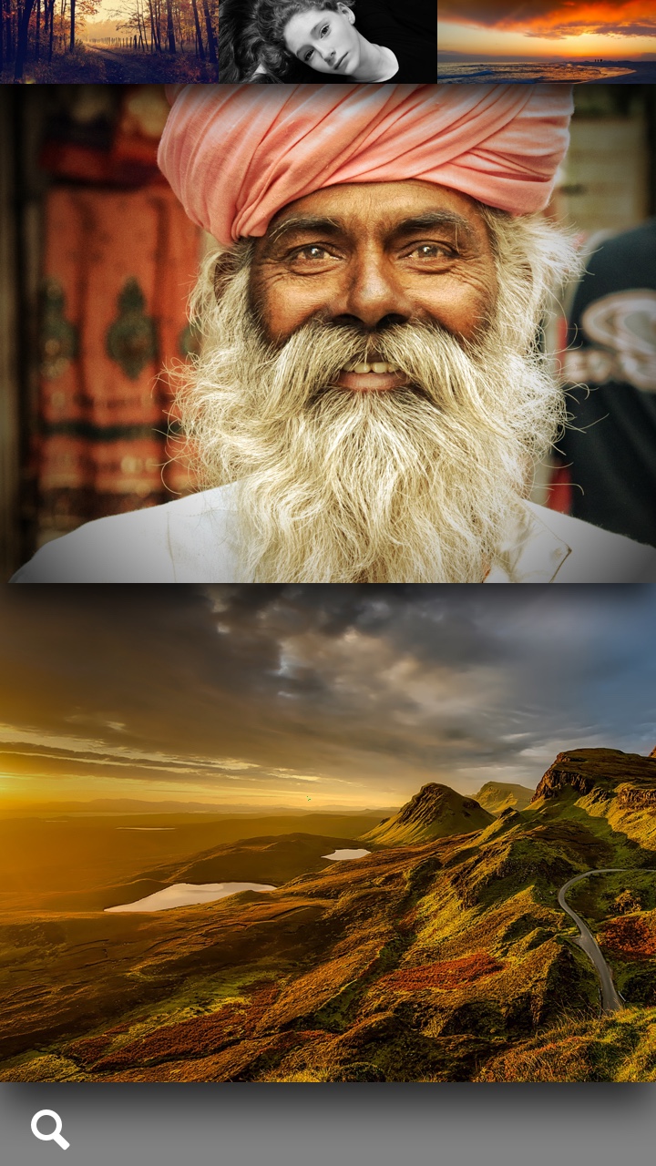
Tapping an image tile selects that image, hiding the unselected images, and transitioning the image into full un-cropped view. A pinch-zoom gesture, transforms the grid array of images to a 3D timeline view.
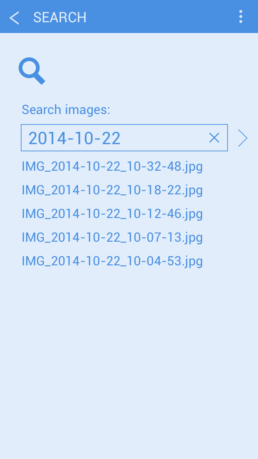
SEARCH SCREEN
Search Screen returns search results from the image data. Searches are saved in a search history. Past searches can be recalled by tapping on the menu button in the upper right.
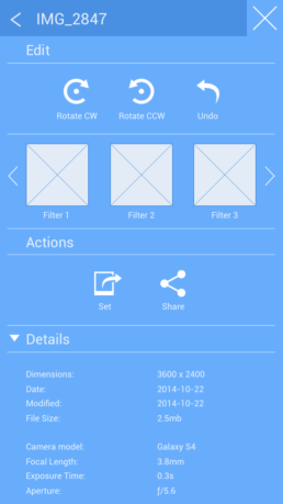
EDIT AND FILTER PANEL
This panel pops over the full screen image when invoked from the menu button in the upper right. The user can rotate the image, apply a filter, set the image as wallpaper or a contact photo or share the image.
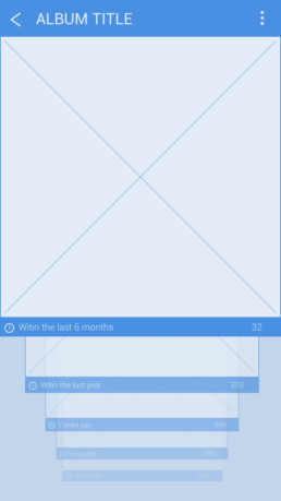
3D TIMELINE
The timeline is arranged in tiles which represent sets of images taken within a specific time period. The stack of tiles is arranged with the “latest-in-front”.
INTERACTIONS
The user taps on the search field and enters a search term on the keyboard. As the user types, the list refreshes with found results. Tapping on the name of an image shows that image full screen.
INTERACTIONS
The user can scroll the list of filters horizontally and tap one to apply the effect. Tapping the Rotate buttons will rotate the image 90 degrees. Tapping on the Share button will open a popup to allow the user to pick a service to share the image. Tapping on the “Set” button pops up a dialog to allow the user to set the image as their wallpaper or assign it to a contact in their contact application. EXIF Details of the image are located below the actions and are not editable.
INTERACTIONS
The user can scroll vertically in the 3D Timeline. Pulling downwards, scrolls towards the latest group of images, pushing upwards scrolls towards the earliest group of images. The front-most tile is scrollable horizontally revealing the images in the time-group of that tile. Tapping the front-most tile displays the image in a full screen view.
Wires and UX
After basic flow was decided upon, I generated wires for all main views, mapped interactions, and proceeded onto the visual design of the app.
MAIN SCREEN
The Main Screen holds the access points for the primary categories displayed as subdivided horizontal bands: ALL; PEOPLE; ALBUMS; SEARCH.
INTERACTIONS
Tapping any of the sections transitions the screen to the next level of the hierarchy for that section.
ALBUM GRID
In this layout, the albums are presented in square tiles with a slightly raised look to indicate that “more” lies behind each tile. This view is accessed when there are multiple albums for a single category.
INTERACTIONS
Tapping an album tile selects that album, hiding the unselected albums, while transitioning the images from the album into view.
IMAGE GRID
The images within an album are laid out in square, flat tiles. The images are arranged by time with the upper-left image being the most recent.
INTERACTIONS
Tapping an image tile selects that image, hiding the unselected images, and transitioning the image into full un-cropped view. A pinch-zoom gesture, transforms the grid array of images to a 3D timeline view.
SEARCH SCREEN
Search Screen returns search results from the image data. Searches are saved in a search history. Past searches can be recalled by tapping on the menu button in the upper right.
INTERACTIONS
The user taps on the search field and enters a search term on the keyboard. As the user types, the list refreshes with found results. Tapping on the name of an image shows that image full screen.
EDIT AND FILTER PANEL
This panel pops over the full screen image when invoked from the menu button in the upper right. The user can rotate the image, apply a filter, set the image as wallpaper or a contact photo or share the image.
INTERACTIONS
The user can scroll the list of filters horizontally and tap one to apply the effect. Tapping the Rotate buttons will rotate the image 90 degrees. Tapping on the Share button will open a popup to allow the user to pick a service to share the image. Tapping on the “Set” button pops up a dialog to allow the user to set the image as their wallpaper or assign it to a contact in their contact application. EXIF Details of the image are located below the actions and are not editable.
3D TIMELINE
The timeline is arranged in tiles which represent sets of images taken within a specific time period. The stack of tiles is arranged with the “latest-in-front”.
INTERACTIONS
The user can scroll vertically in the 3D Timeline. Pulling downwards, scrolls towards the latest group of images, pushing upwards scrolls towards the earliest group of images. The front-most tile is scrollable horizontally revealing the images in the time-group of that tile. Tapping the front-most tile displays the image in a full screen view.
Flow
The overall flow map of the Image Browser uses a consistent pattern of diving into the hierarchy and surfacing back up to higher levels of the hierarchy.
Visual Design
After validating the UX and Interactions I proceeded with the visual design exploration. Based on the guiding principle of an image-first strategy I investigated ways to represent the components of the screens for the interface. I referenced natural lighting of objects as an option for visual style.
Images set within frames have a unique look as a result of the frames casting shadows on the images that makes the images feel less stark. I investigated how this method could be used as a method of representation for the imagery in the interface.
I also investigated how leaves of paper and their shadows could allow interface elements to feel less like an interface, more inviting, while subtly adding a sense of depth.

Motion Design
Main Screen – at rest
I considered how subtle motion within the UI of the main screen could bring content to life. The rationale is that doing so keeps the imagery fresh, and continues to engage the user.
Maintaining Context
When transitioning between screens, the IXD goals were to keep the context upon which the user tapped, transforming the the selected option into it’s new position in the screen layout. This fundamental approach was used throughout the Image Browser application. It was designed and implemented to maintain a grounded sense of location for the user within the IA, using motion to reinforce their intent and solidify confidence in actions reaching a successful conclusion.