Study: Spending and Planning Insights Application
Design Challenge
UX + IA + .:. 2016
Context
In 2016, I worked on the following exercise as a study to investigate an idea for interaction models and representation of historical data from spending accounts, and projections for fiscal planning.
The primary explorations involved:
- Using a consistent model from past to future for representation, and interaction
- expanding a category for detailed analysis
- projecting a slice of data onto different mapping models (list; graph; spatial)
- adding and editing categories to represent impact over time
The exercise was executed over a week’s time in February 2016 as a solo design exercise.
Project Brief
Create a feature within a larger banking app on a tablet interface to enable a customer to review historical expenditures categorized over time. Additionally, the feature should enable a customer to establish new budgetary allowances to plan for future savings and goals, edit the goals parameters and see its impact on future budgetary data.
Screen Descriptions
The following descriptions of the screens identify key aspects about the representations and interactions in the product flow.
To solve the discovery and planning tasks for the feature, the main panel is split in two tabs: “MY PLANNING” and “MY SPENDING”.
- MY SPENDING allows the customer to view their expenditures for the current month.
- MY PLANNING allows the customer to plan for the future and set targets and goals for their projected earnings, such as saving for a car, etc.
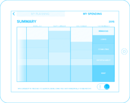
Both views offer the ability for the customer to see their monetary status over time as a graph. In the time axis, the time travels from LEFT to RIGHT. This representation is the logic for placing the primary graph elements in the layout:
- MY SPENDING is focused on the customers spending history. This means, that the time graph will unfold to the LEFT of the main bar chart.
- MY PLANNING is focused on the customers projected future monetary outlook. This means, that the time graph will unfold to the RIGHT of the main bar chart.
The following illustrations highlight this showing a drag interaction to move the time graph through the view.
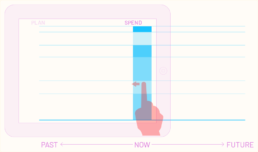
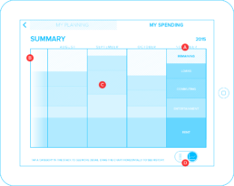
When viewing the “SPEND” portion of the graph, the viewer is looking at the past history of expenditures. The available data for the X axis is displayed to the LEFT of “NOW”. The user can drag to the left to reveal their future plans for spending and saving.
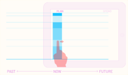
When viewing the “PLAN” portion of the graph, the viewer is looking at the future of their potential categorical spending. The available data for the X axis is displayed to the RIGHT of “NOW”. The user can drag to the right from this view to reveal their past history of spending.
This organization sets up the framework for expected flow and direction. The Bar Graph stays in position when the graphing dimensions are switched, allowing the customer to see their data over time, and maintain a task centric focus on their data. In so doing, non-essential elements exit the view while new elements enter based on the needs of the view. The Bar Chart would travel from one position to the other during the transition to reinforce the context centric nature of the workflow.
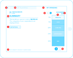
A. BACK button – Returns to the Bank’s Main Screen for the application
B. MY PLANNING tab – Tapping this switches to the planning view.
C. MY SPENDING tab – This view is currently active
D. $ / % toggle – switches between the values being displayed as $ or % of earnings.
E. CURRENT CHART DATE– declares which month and year is being viewed in the chart.
F. EXPENDITURE BAR CHART – Displays the breakdown of the current earnings total into categories in which transactions were made. When the customer taps a category, the data transitions to the CATEGORY view.
G. BAR / TIME toggle – Toggles between the stacked bar and TIME views.
H. SUMMARY – describes in plain text a summary of expenditures for the month.
I. DEFINITIONS – This button goes to a view which allows the customer to manage what expenditures fall into which category.
J. HINT – Gives the user helpful hints on how to interact with the chart
Time Graph
In the Time Graph view of My Spending, the customer can see their expenditure categories over time. The customer can drag the graph horizontally to reveal more of their expenditure history.
When the user returns to the Bar Chart view, the month on the far right of the graph will be revealed as the month being reviewed and further details can be inspected as in the rest of the workflow.
A. CURRENT MONTH – the current month that was displayed in the main view.
B. TIME GRAPH – This graph displays the categories graphed over time as separated by month. The customer can drag horizontally to see more of their spending history.
C. MONTH BAR – The customer can tap a month to slide it to the “current month” position. This will allow them to view other aspects of any selected month in the other available views.
D. BAR / TIME toggle – Toggles between the stacked bar and TIME views.
Category Detail
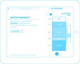
The CATEGORY detail view is activated when the customer taps a single category in their stacked bar chart. This view displays more details about the customer’s expenditures within that category during the month.
In this example, the customer has chosen the ENTERAINMENT category. The main bar chart shrinks to half scale, preserving the selection on it, and showing a connection to the new stacked bar chart of the sub-categories within. This connection helps the customer understand they are “zooming into” a category and can view the contents of the new section of the chart further. By animating to/from this view, the customer maintains their context along with their selection, keeping them oriented within the dataset.
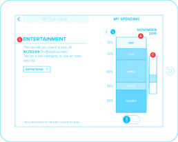
A. SUB-CATEGORY STACKED BAR CHART – a stack view of the sub-categories from the selected Main Category. Tapping a sub-cateogory will expand details of the sub-category in a new view.
B. CATEGORY – A high-level overview of the category selected from the main view.
C. MAIN VIEW – a minimized version of the main bar chart showing the category which was selected. Tapping this will return to the main view.
Detail – List View
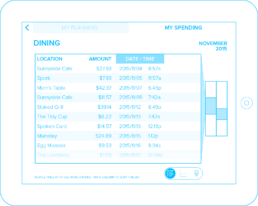
The SUB-CATEGORY detail displays the transactions for the sub-category. The customer can switch between 3 types of view of the data:
- LIST
- TIME GRAPH
- LOCATION
The customer can examine their expenditure history to have a better understanding of where they are spending their money. Switching between the 3 types of views transmutes the data in the view to preserve context and help the customer maintain an understanding of the different projections of the data they are inspecting.
Additionally when the Sub-Category Detail view transitions into the frame, the Main Expenditure View and Category Views are minimized to vertical bars. They each maintain the highlighted region which the user selected to arrive at this view. The minimized Category view now has the connection displayed to the Detail view to show context.
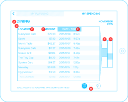
A. SUB-CATEGORY – The name of the sub-category the customer has selected.
B. LIST – The list of transactions in the sub-category in the current month
C. LOCATION column – This displays the store location where the transaction took place. Tapping the column header will force the sort by this column.
D. AMOUNT column – Displays the amount for each transaction. Tapping the column header will force the sort by this column.
E. DATE/TIME column – Displays date and time of the transation. Tapping the column header will force the sort by this column.
F. Minimized Category Bar – A minimized version of the category bar with a highlight of the sub-category which was selected in that view. Tapping this bar will return to the CATEGORY view.
G. Minimized Expenditure Bar – A minimized version of the bar chart from the main view, with a highlight of the category which was selected in that view. Tapping this bar will return to the MAIN view.
H. LIST / TIME / LOCATION toggle – Toggles between the LIST, TIME, and LOCATION views of the data in the selected sub-category
Detail – Time View
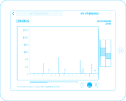
The Detail view may be switched to display a graph of the customer’s expenditures over time. The data points in the graph view transmute from their respective locations in the previous view. This requires the representations to transmute visually as well as change locations to map to the new data projection.
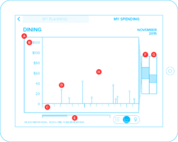
A. GRAPH VIEW – The time/expenditure graph of the data for the current month.
B. AMOUNT AXIS – The vertical axis represents the amount of the transactions. This view scales to accomodate the largest expenditure for the month.
C. TIME AXIS – The horizontal axis represents the time of each transaction.
D. EXPENDITURE – The expenditure is represented by a dot on a stem which roots the expenditure in the time axis. Tapping this will open a popover showing the details of the transaction (see next page).
E. TIME SCROLL BAR – The customer can scroll through the transactions of the month using the time scroll bar.
F. Minimized Category Bar – A minimized version of the category bar with a highlight of the sub-category which was selected in that view. Tapping this bar will return to the CATEGORY view.
G. Minimized Expenditure Bar – A minimized version of the bar chart from the main view, with a highlight of the category which was selected in that view. Tapping this bar will return to the MAIN view.
H. GRAPH WINDOW – The graph window may be dragged horizontally to allow the user to pan through the time domain.
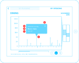
A. DATE / TIME – The date and time of the expenditure.
B. LOCATION – The name of the establishment where the expenditure was made.
C. AMOUNT – The expenditure amount.
D. CLOSE – This button will dismiss the popover. Tapping outside the dialog should also dismiss the popover.
E. EXPENDITURE – This is the expenditure to which the popover is attached. The popover should remain “attached” to the expenditure if the graph is dragged horizontally by the user.
Detail – Location View

Tapping the Detail Map View of the sub-category shows the customer’s transaction history with locations of their expenditures displayed on a map. The Transactions are numbered in order so that the customer can see the sequence of expenditures.
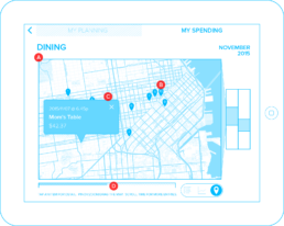
A. MAP – The local region where the expenditures were made. The customer can interact with the map by panning/dragging and using pinch to zoom.
B. LOCATION PIN – The location of the establishment where the expenditure was made. Tapping the pin displays a detail popover.
C. DETAIL POPOPVER – Displays a detail of information when the user taps the location pin.
D. TIME SCROLL BAR – The customer can scroll through the transactions of the month using the time scroll bar.
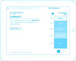
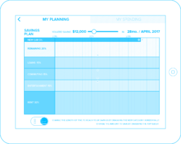
My Planning View
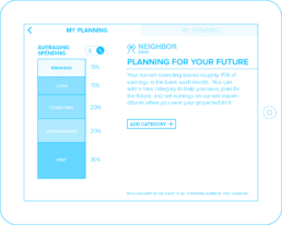
In this tab view, the customer can start to plan how they limit their spending, in order to save for a future purchase by adding a new category. The customer can interact with existing categories, to create spending limit warnings, notifications and alert emails or SMS to help them manage their spending habits.
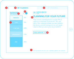
A. BACK button – Returns to the Bank’s Main Screen for the application
B. MY PLANNING tab – This view is currently active.
C. MY SPENDING tab – Tapping this switches to the spending view. The user can also drag the screen to the right to pull the bar chart to the right to switch back to the Spending tab.
D. $ / % toggle – switches between the values being displayed as $ or % of earnings.
E. AVERAGE EXPENDITURE BAR CHART – Displays the breakdown of the average earnings and expenditures into categories in which transactions are typically made.
F. CATEGORY – A general area of expenditures. When the customer taps a category, the page switches to controls for that category to assign notifications etc.
G. SUMMARY – describes in plain text a summary of how the customer can interactively plan for their savings.
H. ADD CATEGORY – A button which will add a new category for the user to enter their savings preferences. Tapping this button takes the user to the New Savings Category page.
I. HINT – Gives the customer helpful hints on how to interact with the chart
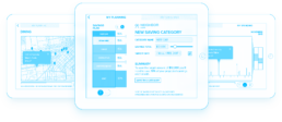
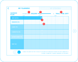
Planning – Add a Category
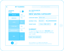
When the customer has tapped the “ADD CATEGORY” button, the options for creating a new category are displayed. The user can name the category they are adding, change the amount to be saved, and target date to reach the savings goal.
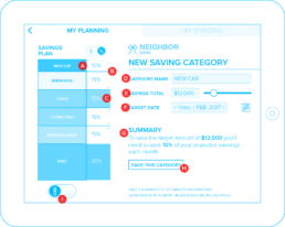
A. NEW CATEGORY – The new category is added to the top of the Stacked Bar Chart and displays the % in the column next to the main stack.
B. SAVINGS % ADJUSTMENT HANDLE – This control allows the customer to set how much they would like to save each month to reach their goal in the new category. It is set by dragging the handle vertically.
C. FIXED EXPENDITURE – This expenditure category cannot be adjusted since it is for loan payments.
D. CATEGORY NAME – The customer can tap the text field to change the name of the category.
E. SAVINGS TOTAL – This is the goal for the savings in the category. The customer can either tap the number field and enter an amount using the keyboard, or slide the slider to set the amount to save.
F. TARGET DATE – This is the date by which the customer would like to reach their goal. This can be set by either tapping the “<” or “>” buttons on the text field, or by tapping the calendar icon to pop up a calendar widget.
G. SUMMARY – describes in plain text a summary of how the customer will achieve their goal for their savings.
H. SAVE CATEGORY – A button which will save the new category for the customer. Tapping this button returns the customer to the My Planning Main page.
I. BAR CHART / TIME GRAPH toggle – tapping this button takes the customer to an interactive view enabling adjustment of achieving the savings goal over time.
Planning – Time View
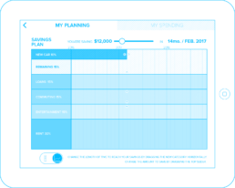
When the customer switches to the time view of the bar chart, the new category can be dragged in time to change the duration for the saving category, while preserving the desired dollar amount. As seen in the illustration below, this will alter the amount to save each month necessary to reach the same dollar goal. The display of the duration updates with the interaction, showing the customer how many months it will take to achieve their goal.
Additionally the customer can change the amount of the other categories and see their effect interactively on their overall spending and saving strategy. This interactivity gives the customer a new insight of the impact of their savings on the various categories in which they currently spend.
A. NEW CATEGORY .: RESIZE HANDLE – The new category can be scaled in time shrinking and growing the amount to save each month.
B. EXISTING CATEGORY .: RESIZE HANDLE – Existing categories can be expanded or reduced by moving their boundaries vertically in the chart.
C. DESCRIPTION BAR – A plain english sentence which updates dynamically showing the customer how much they will save over a length of time.
D. TARGET SAVINGS SLIDER – The customer can drag the slider to set the amount to save. This will lengthen or shorten the duration of the savings.
E. DURATION – This month / date combination shows the customer how long it will take to reach their goal.